About
PDK FIT is a personal training service based in Montreal, QC. They use a unique and multidisciplinary approach of strength development to help improve all aspects of health for their clients. They wanted their branding to reflect the nature of the business, their friendly attitude, and their holistic approach to fitness.
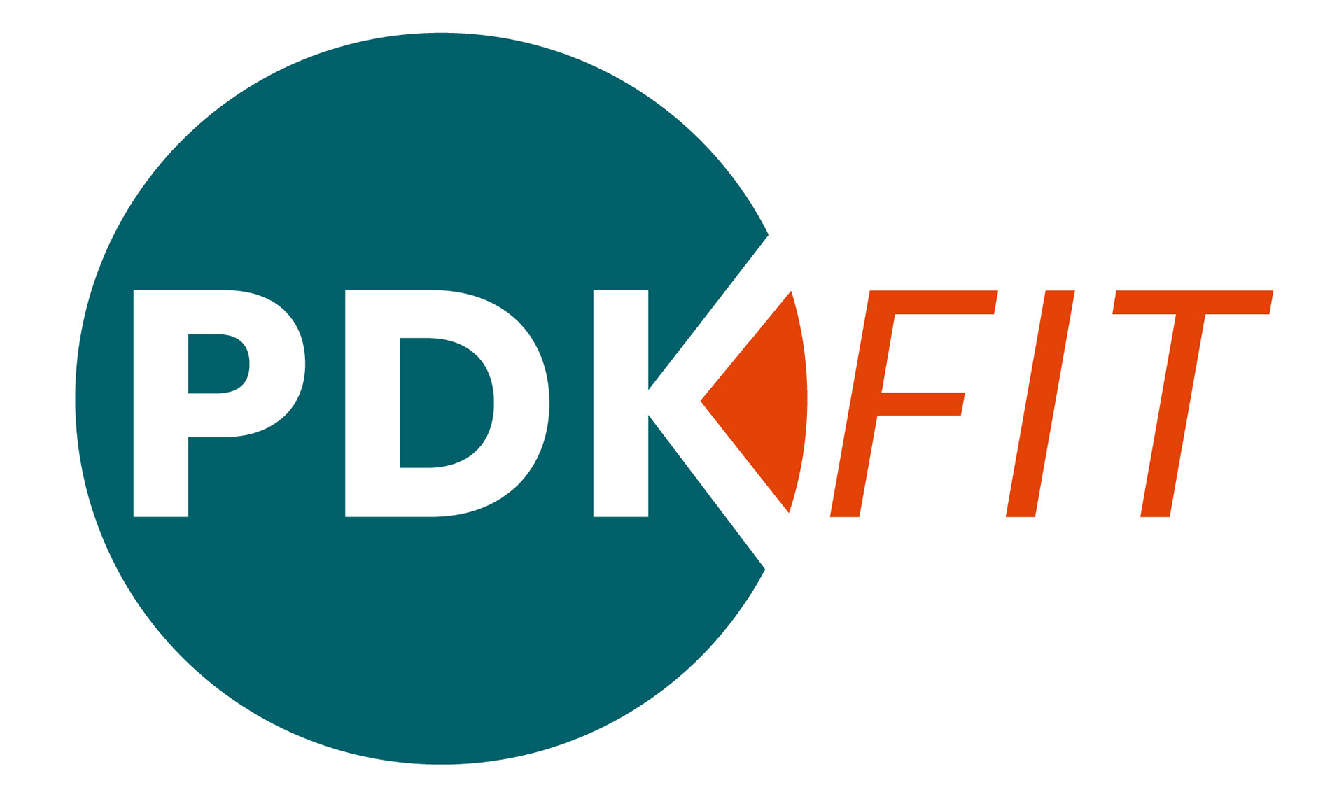
Logo
The global symbolism of the circle paired with the movement in the italic name gives a minimalistic but effective graphic element to the logo.
Logo concepts
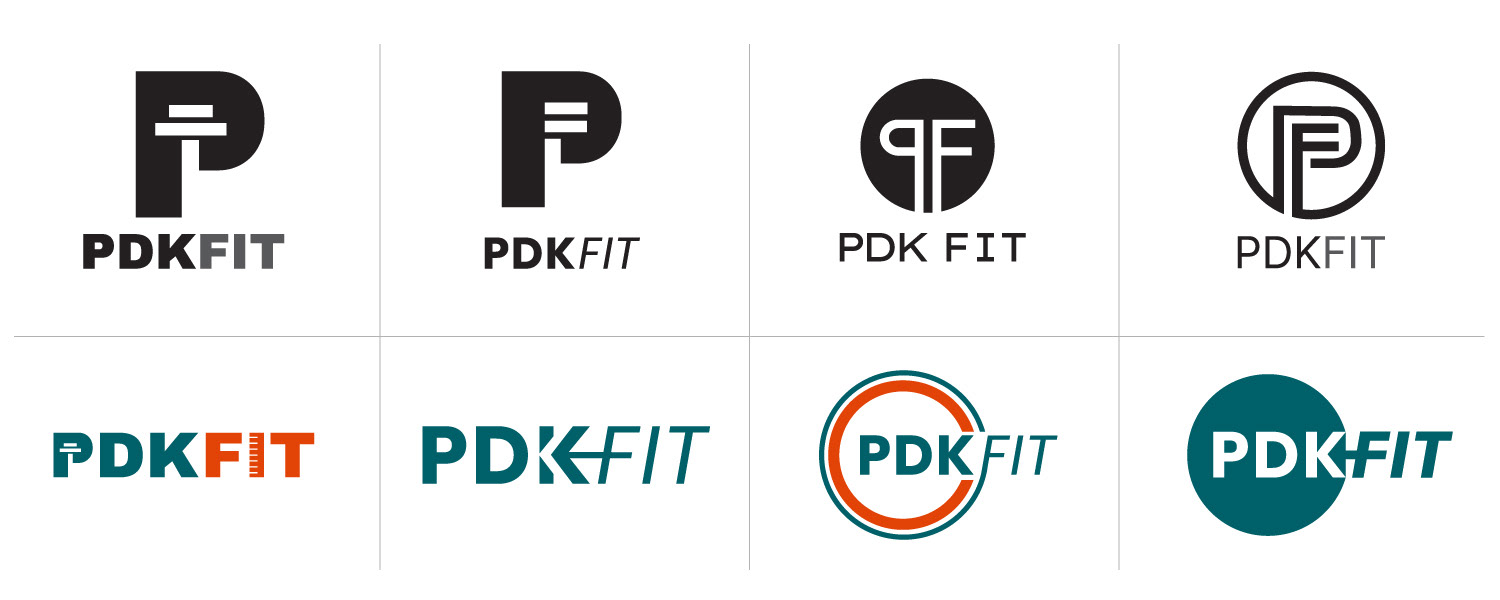
A few logo concepts along the way before finalization. Different elements were explored to symbolize their business such as a circle, arrow, fitness equipment, and the initials of their brand.
Branding Elements
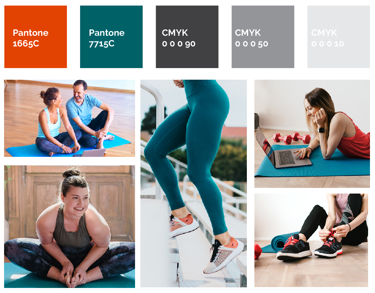
For colours, a blue/green mix was chosen to give an earthy wellbeing tone mixed with professionalism, while the red/orange was chosen for its energetic and friendly tone. Bright imagery with the main colours were used as the main visual element, along with some colour blocking. Text was in charcoal, so as to further soften the effect which overall made for a friendly and open feel.
Website
Colours, photo style and typography all came together to showcase their branding in their website. I built their website and edited customized imagery for all of the elements to fall into place to showcase their company in the best light.

To view the full website, visit www.pdkfit.com