About Ash & Row
Ash & Row creates high quality, unique, handcrafted hats in Montreal. They focus on sustainable practices and use recycled materials in their process to create the tailored final products. Along with creating their brand and visual identity, I helped lead them to their name. Ash being a nod to a phoenix rising out of the ashes to symbolize their renewal/recycling practices, and row for the action of moving forward and constantly building new practices within their process. It is also an anagram for the first 3 letters of the owners first and last name.
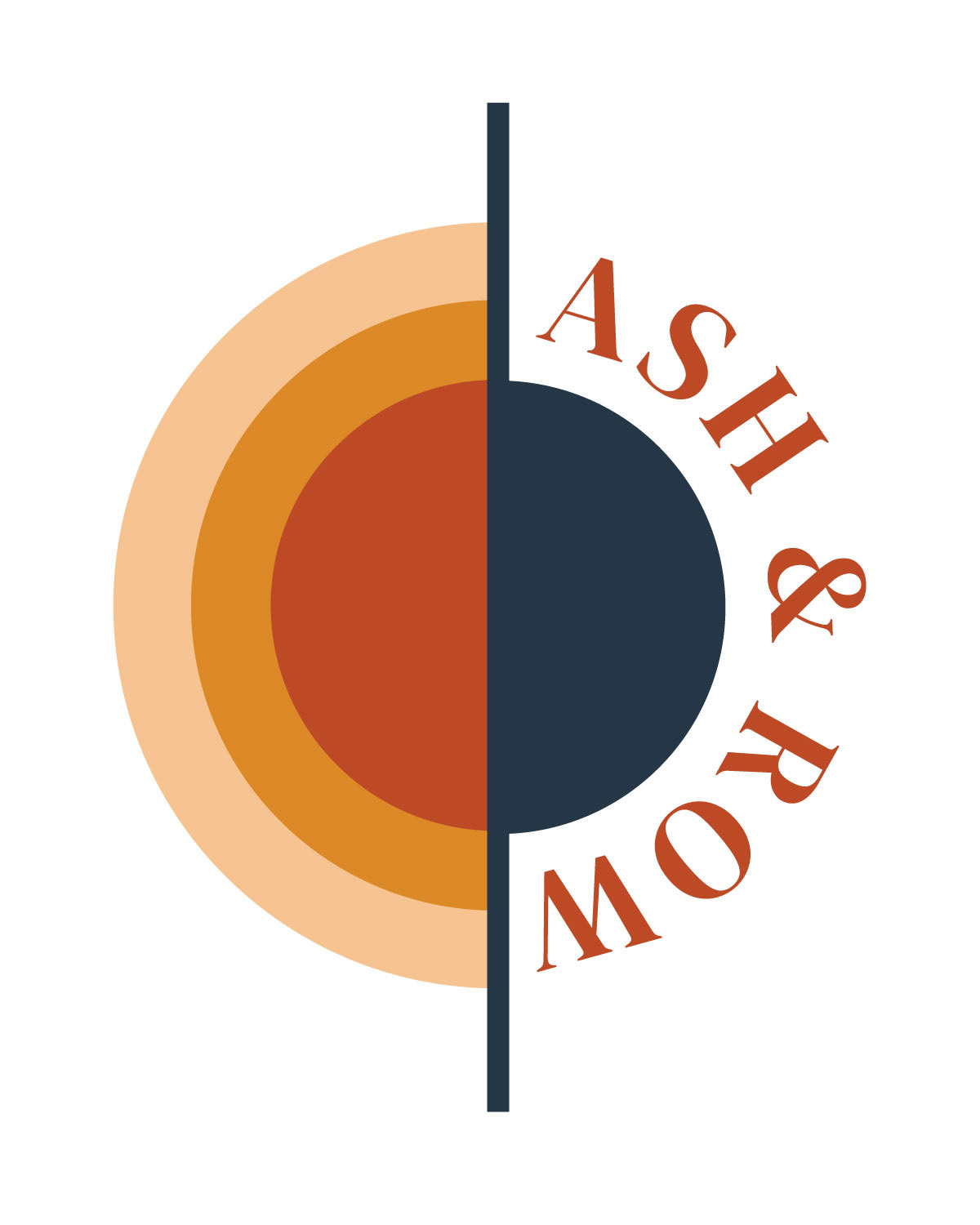
Logo
The logo I created uses a minimalistic figure of a hat in dark blue, and stylized sun denoting warmth and a new day to symbolize the repurposed materials in their products. We chose a warm colour palette to reflect the friendly nature of their brand with the contrast of the deep blue as a natural and grounding element.
Logo Concepts
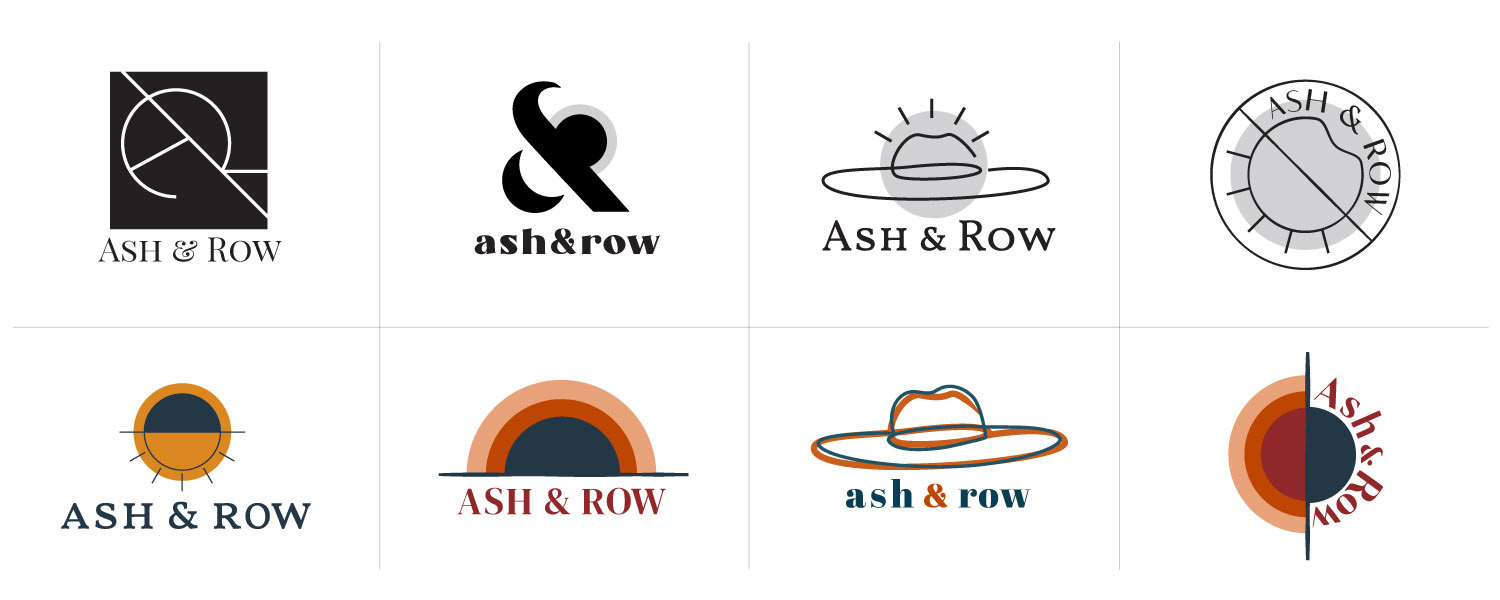
A few logo concepts along the way before finalization.
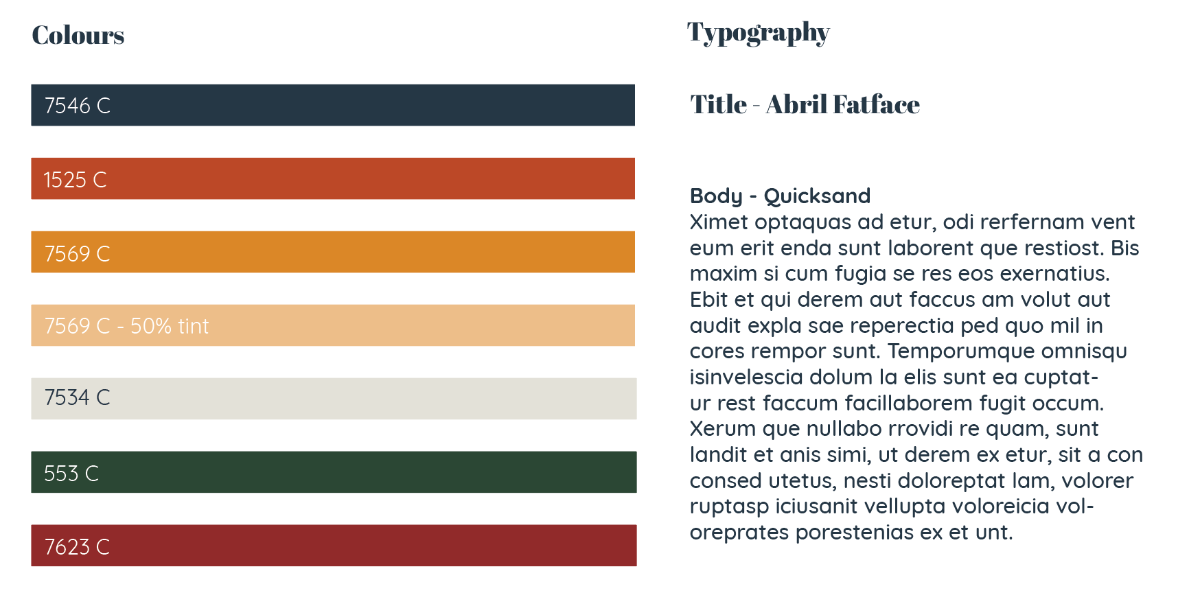
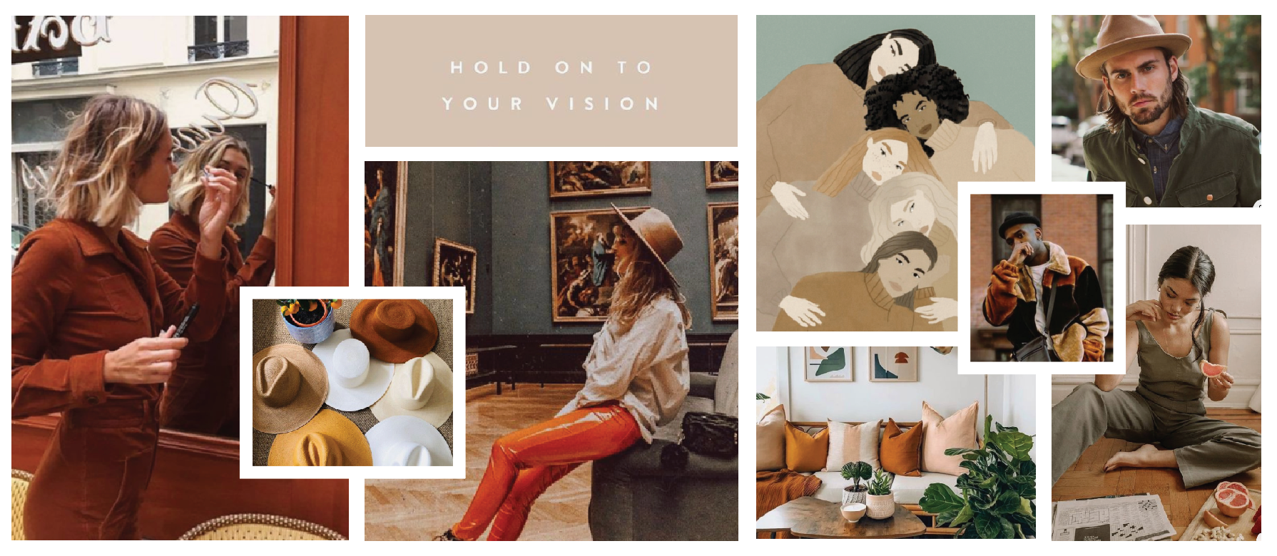
Branding Elements
Light, warm, neutral and natural tones were chosen for their brand. Photos depicting snapshots of everyday life, behind the scenes of the hat-making process, and a mix of quotes/artwork that match the brand personality are used to give their brand an authentic and eclectic feeling. The typography was chosen to reflect their friendly and unique nature.